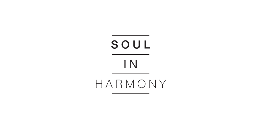
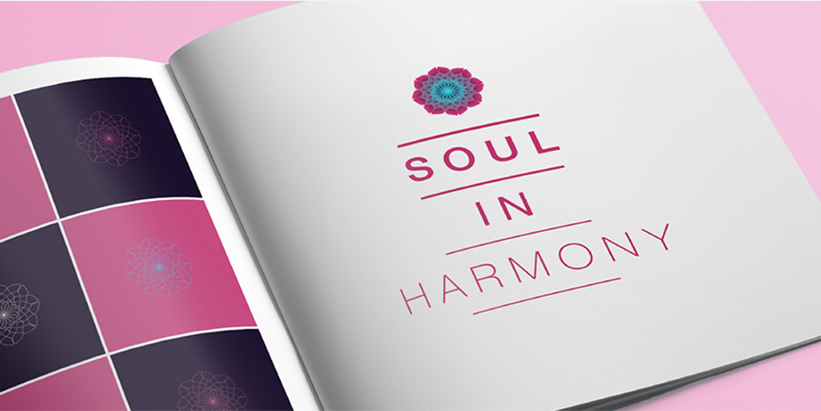
Soul in Harmony believes that everyone harbours an oasis of peace. It helps people tap this source of calm through mindfulness training and meditation. Our identity and motif reflected this belief.
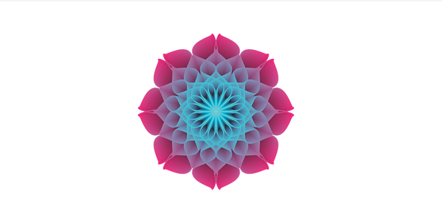
The primary colour palette represents a gradual transition in the individual's state of mind: from one in conflict to one at peace.
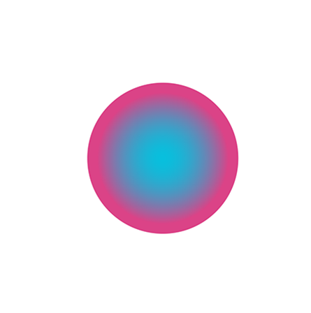
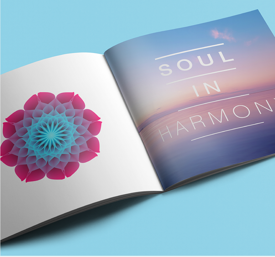
The morning sky is the inspiration for the secondary colour palette. It promises a new day filled with peace.


The wordmark begins thicker and heavier. Over three steps it becomes thinner and lighter. A reflection of the brand promise.

The motif draws its influence from the Lotus. The flower blooms, pure and undefiled by its surroundings, but its feet remain rooted to the earth.
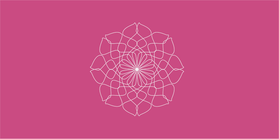
On smartphones, the motif transforms into an app that helps users attain peace and mindfulness.
